Will the Burger King rebrand sizzle or fizzle?
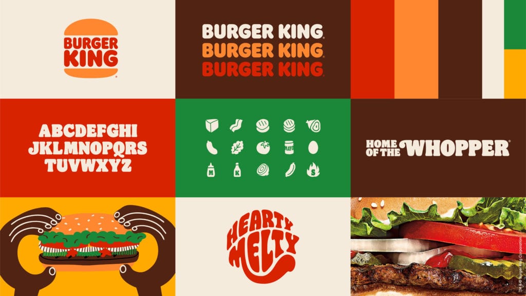
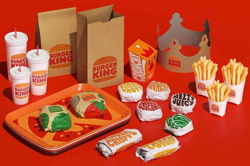
For the first time in 20 years, the American fast-food restaurant Burger King has rebranded. Changes include a revamped logo, packaging, and uniforms designed by creative agency Jones Knowles Ritchie. The Burger King rebrand leans heavily on its branding elements in the 70s, 80s, and early 90s.
Often, legacy brands that update their look are judged harshly by the marketing and advertising world (Taco Bell Rebranding Fail). Companies tend to get lumped into a “changing for the sake of changing” category. New Chief Marketing Officers (CMOs) want to put their stamp on a brand or get bored rehashing the same advertising campaigns year after year.
It could be easy to down Burger King for updating, or in the case reachig to the past for its branding. However, this time BK deserves credit for getting many aspects of a rebranding correct.
Simplified Logo
Nowhere does the adage “less is more” mean more than in company logos. The main reason is how the human eye sees words and shapes. Al Ries, the co-author of the legendary marketing book Positioning, covers the idea of logotypes extensively in YouTube videos. Two-by-four logos are a match made in human brain heaven.
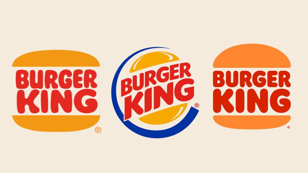
Burger King’s retro logo (left) is easy to read because of its straight-line look and simple font type. Because your brain seeks simplicity, the retro logo’s dimensions give your brain less work to do. Conversely, the logo introduced in 1999 (center) rotates the words’ angle and puts them in a circle, making your brain do much more work to decipher it. The human brain interprets information overload as chaotic. Chaotic images get passed over for more simple ones.

The new/retro look rolled out this year (right) gets back to a less busy, more pleasing, more manageable logo for the human brain to digest. Furthermore, slight updates to the shapes outline a burger bun better. The combination reinforces Burger King as a fast-food restaurant selling burgers more than the previous logo. Shockingly, Shake Shack and Burger King are the only national burger chains’ logos depicting a burger bun. Another great reason to return to the retro look.
One of the most significant advantages of having a simple-to-read logo in a two-by-four design is how easily identifiable it is from a distance. Five Guys, Chick-fil-a, Smash Burger, and Sonic all have logos that read quickly and efficiently while driving. Also, even when shrinking the logo for smaller screens like smartphones, the symbols hold up where Culver’s, Fatburger, and White Castle lose readability the smaller they get.
Return to Muted Color Palette
Burger King discovered its muted brand palette never really went out of style. Just ask In-n-Out Burger, Whataburger, or Wendy’s about leaving original colors alone. Again, small changes to the founding colors make the branding pop. Burger King can own this new retro look. Other brands will need to stay away from using similar colors in branding designs.

Ten Laws of Rebranding
1. Avoid rebranding because you are bored with the brand’s look and feel—your investment in the brand is exponentially higher than your customers.
2. Conduct marketplace and customer research projects before even considering a rebrand.
3. Avoid any rebranding causing your logo, fonts, or styling to be more challenging for customers to read or identify.
4. Avoid a rebrand that is significantly different than your current branding.
5. Avoid giving weight to input or suggestions of those closest to you. Your immediate family’s opinions on the rebrand don’t count.
6. A rebrand is more than an updated logo and new colors. Your rebrand should be a thread that goes through the entire organization.
7. A rebrand should include words and phrases used to describe products or services.
8. Customer-facing employees should get the most training on what a rebrand is all about—and should be drilled on the words and phrases to describe products or services.
9. Committing to a rebrand is difficult. Rebranding isn’t over when the press release goes out—you need a long-term plan to make it stick.
10. You will regret rebranding until you don’t. Overhauling a brand is scary. Commit to the rebrand, and the rebrand will commit to you.
Better Product Packaging
According to Raphael Abreu, head of design at Restaurant Brands International, which owns the Burger King, the rebrand is “to get people to crave our food; its flame-grilling perfection and above all, its taste.” While this is a tall task to ask for any food packing, the updated looks and feels in the right direction.
The larger font on cups and wrappers serves two purposes. The words confirm a wise purchase and reinforce the goodness inside. Plus, the logo and the text can be seen by those around the person who’s eating. Both are essential for fast food restaurants.

Conclusion
Only time will tell us if the Burger King rebranding worked. Brands often get a lift when a rebrand hits. It’s typically a short-lived bump because the rebrand has nothing to do with a change in brand perception or, in the case of fast-food restaurants, a shift in food quality. Burger King should get credit for making choices better positioning it to achieve the desired outcome.
You may also enjoy Is TV Advertising Still Effective, Relevant, and Worth It?.
