Taco Bell Rebranding Fail
2016 seems to be a popular year for big brands to fiddle with logos. Over the summer, Subway made tweaks to its look and others are following suit. And whenever a brand attempts a re-branding effort the Colling Media office noise level jumps. This week Taco Bell triggered a lively discussion about how successful the brand will be with its logo evolution. Here are highlights from our Taco Bell logo debate and a recommendation for what the brand might have done instead.
How did Taco Bell get here?
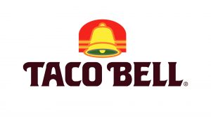
In 1985 the brand introduced its bell visual hammer (defining image). It’s here that the previous two logos most directly evolved from. Bright colors and a unique font make up the beginnings of the modern Taco Bell logo.

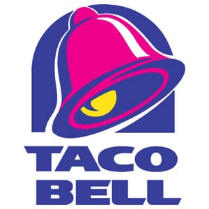
In 1994 Taco Bell updated its logo to include a larger bell visual hammer and squared the logo by stacking the name. This version of the logo is probably the most iconic and most recognizable to customers and brand loyalists.

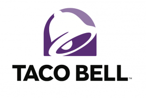
Introducing Taco Bell’s 2016 logo
The new version of the Taco Bell logo smartly keeps the bell visual hammer. Unfortunately, the blue color has been changed to washed-out purple leaving the bell-less powerful and less of a focal point for the eye. The contrast of the black lettering and the purple image plays awkwardly. The image feels like it’s two separate pieces instead of one seamless design. The distance between the image and brand name also plays into the disconnected feel.
The real question is, “Of all the designs that could have been used, why this one?” For Taco Bell outsiders (like you and I), we may never know. This question moved our team’s conversation into what might have been.

Colling Media Would Have Suggested Something Like This
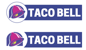
We at Colling Media would have gone in a different direction. Our recommendation would have been to create a 2×4 logo. The 2×4 format has a host of benefits including a design aligning with how human brains process visual information. For more on 2×4 logo designs, we suggest watching a great video from the Godfather of Marketing Al Reis, here.
These suggested logos options were created quickly in Canva:

We feel our two recommendations maintain more Taco Bell brand essence and thematically play better than the new one. These 2×4 logos allow your eyes to survey the bell visual hammer then move and stay on the Taco Bell name. Additionally, 2×4(ish) formatted logos take up more building real estate at franchise locations – which we feel is a huge benefit. If nothing else, customers would be able to see the logo from distance better. Another benefit is our logos easily scale for digital or print where square or busier logos have trouble doing the same.
A Last Word on the Taco Bell Logo
Colling Media is a fan of all brands and our “state of marketing” debates are full of passion for the industry and its continued success. We offer up this Taco Bell logo blog as part of a bigger picture to learn lessons from today’s brands and marketing tactics. Everyone at Colling Media wishes Taco Bell the very best with its new logo design and continued success in the fast-food category.
You may also enjoy this article: Brand Reputation Management – Why your company needs a crisis plan
Colling Media is a Phoenix, AZ-based full-service advertising agency providing advertising strategy, digital advertising, and media buying services.
